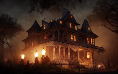
Very Scary Websites for Halloween!
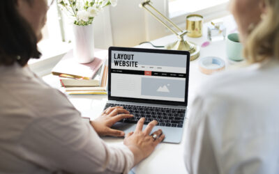
When people want to know more about your business the first thing they will do is visit your website. The first impression you make on your clients doesn’t come from a handshake or a phone call, it comes from your online presence. Even if you hand someone a business card, the next contact they will make with your business is through your website.
In order to make a good first impression, your website must be well constructed, easy to navigate, and easy to find when someone searches for the few details they remember from a conversation or recommendation. Your website is arguably the most important representation of your business or the services you provide.
For the month of October and Halloween, we want to have a little fun with scary websites. What makes a website scary? There are a few things that can easily frighten away perspective, or even current, clients. These include confusing navigation, poor quality photos, badly written content, broken links, and
Some of these ideas may be more likely to affect your visitors than others, but all of them (and a few others we haven’t mentioned) can cause your visitors to get lost in the pages of your website. Your clients can become web surfing zombies (
Here are a few examples of horrible websites lurking in the Internet’s darkened bedroom closets.
1. Mummy’s Website – Badly wrapped site with some loose ends.
Suzanne Collins Books – http://www.suzannecollinsbooks.com/index.htm
You might think an author with the success enjoyed by Suzanne Collins would have a professional looking website to represent her and her writing. However, her website is as sparse as the food in a post-modern world where kids fight to the death for their village’s well-being. The word “emotionless” also comes to mind.
What’s wrong with Suzanne Collins’s website? Everything. It looks like the wrapping came off before it was complete. It doesn’t speak to her visitors. The pages are blank and lifeless, providing very little content that engages visitors.
I guarantee the people who stop by would like to know more about Collins and her books, but they sure aren’t getting those answers from her site. In fact, they may even utter a curse or two before they move on.
2. Dracu-Site – An energy-sucking experience that leaves its visitors exhausted
Lings Cars – https://www.lingscars.com/
Ling Valentine really wants to sell you a car. She wants to sell you a car so badly that she put in the time to build a website that includes movies, games, giveaways, and even karaoke. The site also lists every single make and model she has in stock in the column on the left side of her website so that, while you are craning your neck to take in the mile-long list, she can move in for the kill.
Visitors to Ling’s Internet-based Lair of Chaos are treated to an unending assault on the senses. The homepage looks more like a pinball machine than a business website. However, Ling states – several times, “You can trust me!” and since it’s on the Internet, it must be true.
For an extra treat, click on the About Ling link in the left the column and then select Movies. There’s enough content there to drive most people batty.
3. Franken-Site – Apparently pieced together from old, dead web pages.
Yale University School of Art -http://art.yale.edu/Home
You would think a prestigious school like Yale would never allow something this bad to represent their hallowed halls. However, they have gone to great lengths to prove just how horrifying a good organization’s website can be. Click on any link in the left-hand column and prepare to have your senses assaulted.
How many things are wrong with this website? Everything. It’s poorly designed. The graphics are awful. The pages that do have content are overly busy, with chaotic backgrounds that distract and confuse the site’s visitors. Nothing on the site is aligned either, drawing the viewers eyes in too many directions without allowing them to settle in one place and absorb the information from any of the text.
This website deserves a solid 10 on the Homepage Horror Scale. Maybe, just maybe, we’ll go to 11.
Hopefully, these three examples make it easy to see what makes a website difficult to navigate, or overwhelms visitors with too much color, movement, or information. You only have a few minutes to connect with your visitors, so your home page must be easy to understand and navigate. The content is also important, which means spelling and grammar are both critical, plus the message you are trying to convey must be clear and concise.
If your business website is not helping to bring new customers to your door, please contact the GreenCup Digital team and let us help to make it be the best representation of your business it can possibly be.
Single-Page vs. Multi-Page Websites: Which One Is Right for Your Business?
Are you thinking about a new website or finally ditching that outdated one? Before you get lost in the fonts and color palettes, one decision can make or break your site: single-page or multi-page? Not sure what that even means? You're not alone. Most people don't...

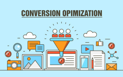
Content Marketing That Converts: A Small Business Guide to Turning Clicks Into Customers
Let's be honest: the phrase “content marketing” sounds like a term some suit came up with in a conference room filled with stale donuts and lukewarm coffee. But take away the corporate buzz words, and you'll find a potent (and surprisingly practical) tool. Content...
Small Business, Big Power: GreenCup’s Unlikely Secret To Success
You may not want to believe it, but hiring a massive digital marketing agency doesn’t always deliver big results—especially for your small business. In our experience, it’s strong leadership that truly drives growth. Great leaders create a culture where people thrive,...