In August of 1991, a group of scientists at the Swiss Physics think-tank, CERN, did the unthinkable. Led by English computer scientist, Tim Berners-Lee, the group created an interconnected web of information and intrigue known as The Internet or the World Wide Web.
This event has done more the good of humanity and the future of the human race than, quite possibly, any other innovative leap in recorded history.
Or, has it…
The link between man and machine has also unleashed a torrent of creativity, spreading far and wide across the globe, which many would argue helps to speed the dissemination of information and ideas.
However, it has also created a terrifying flood of poor taste, and poor judgment, that can most easily be compared to a night of frighteningly bad performances at the local karaoke bar by drunken pop star wannabes.
Dressed in their best, and loudest, Hawaiian shirts, they flail away at Brittany Spears or Journey lyrics with cracking voices, always just out of tune and out of time with the music until their exit from the stage is met with half-hearted golf claps.
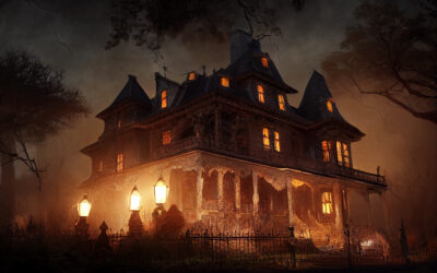
Read on for our yearly acknowledgment of our biggest fear, terrible website design! This is the web’s best examples of loud Hawaiian shirts and out of tune attempts at stardom. Please keep the migraine medication handy before proceeding at your own risk.
Arngern.net is Norway’s best and brightest attempt to compete with Craig’s List. An obvious threat to Craig’s List’s world-wide domination, the site is filled with once-in-a-lifetime purchasing opportunities for products such as Dummy-Kamera, Laser-jammer, and Hoverpod.
Although it’s hard to say how much traffic this monument to poor website design actually sees, it’s easy to tell that the creators take their classified ad business seriously since shoppers can purchase a flying commuter car. Although it may or may not have been assembled with a hot glue gun.
The car, not the site. Well, maybe the site too.
If color matching is a science, then this website must have been created to prove what hues do not belong side by side. For this self-proclaimed “leader in childcare juice,” the intrepid web designers behind Penny Juice’s rainbow of colors obviously sought to make their website match their catchphrase – “A Rainbow of Exciting Flavors.” While we can’t speak for the juice, their website certainly leaves a bad taste in your mouth.
Penny Juice’s site is overflowing with enough facts and statistics to fill 1 or 2 solid sentences. However, the most important information is right on the front page. Potential customers can learn that if you want to serve nutritious, concentrated, fruit-based beverages to children that do not need to be refrigerated, PennyJuice.com is right for you.
Be sure to keep the antacids handy because scrolling through the site might just make you nauseous.
There bad websites and there are bad websites. However, when a prestigious school the size of Yale makes their art school’s webpage accessible to the general public, you probably wouldn’t expect it to fall into that category.
But, Art.Yale.edu is a very bad website.
If the site was an experiment in artistic expression, it would be the kind of experiment where a fountain of toxic chemicals unexpectedly shoots out of a paper mache volcano and covers the table below in a mess of fluorescent slime.
According to the editor, or administrator, or inmates, the site is “this website reflects life in our institution in all its heterogeneous dimensions” and “in consequence of such openness, encounter content that surprises you or with which you don’t agree.” I’m pretty sure most people would agree that the site is awful.
The site does have one redeeming feature though. Providing a backdrop for the hideous design and scattered information is a tiled photo of a dog riding a tortoise. Because, you know. Dogs and turtles.
Last, but definitely not least – no list of worst websites ever would be complete without an actual example of the world’s worst website. Ever. And, here it is.
TheWorldsWorstWebsiteEver.com/
In case you’re unsure, the link above leads to the world’s worst website ever. Not just this week, or this year, but ever. The stated purpose of the website is to be parody about breaking every single rule imaginable regarding website design and it does deliver on its promise to be truly awful.
However, mixed into the middle of the carnival midway of flashing lights and chaotic colors are some marginally useful links. For those brave enough to set the Worst Website Ever as their homepage, links to Yahoo, Google Maps, and the main homepage for Kentucky Lake could provide time-saving shortcuts to some powerhouse resources.
Really, who doesn’t want to visit KentuckyLake.com at least once a day?
If the scrolling text, distracting GIFs, and horrible color combinations aren’t enough to make you spend hours staring blankly at the site, the links to Shocking Photos should do the trick. Especially since they are full of such horrifying content as the sun setting over a suspension bridge and asphalt snaking off toward the horizon.
Best of all, the site’s creators do not appear to be content to rest on their laurels, basking in the glow of their brilliantly bad creation. Stated clearly on the home page for all to see is the promise of a newer, more worst-er, world’s worst website. Although the launch date is a mystery, the endless possibilities have got to be enough to keep you coming back for more.
Hopefully, your website isn’t as scary as the examples listed above. A website should be easy to navigate without too much color or movement that can overwhelm a new visitor. You only have a few seconds to connect with a potential client visiting your site to learn more about you, all the more reason to want your homepage to be inviting and understandable. If you need help making your own website less frightful, please contact us here at GreenCup Digital and we will make sure your website doesn’t scare away your visitors.
Happy Halloween from GreenCup Digital!